Essential details to double-check on a mobile screen
A mobile screen offers less physical display space, and moving quickly between wallet apps, exchange accounts, and authentication steps can easily lead to rushed decisions. In blockchain finance, sending funds across the wrong network can result in permanent asset loss.
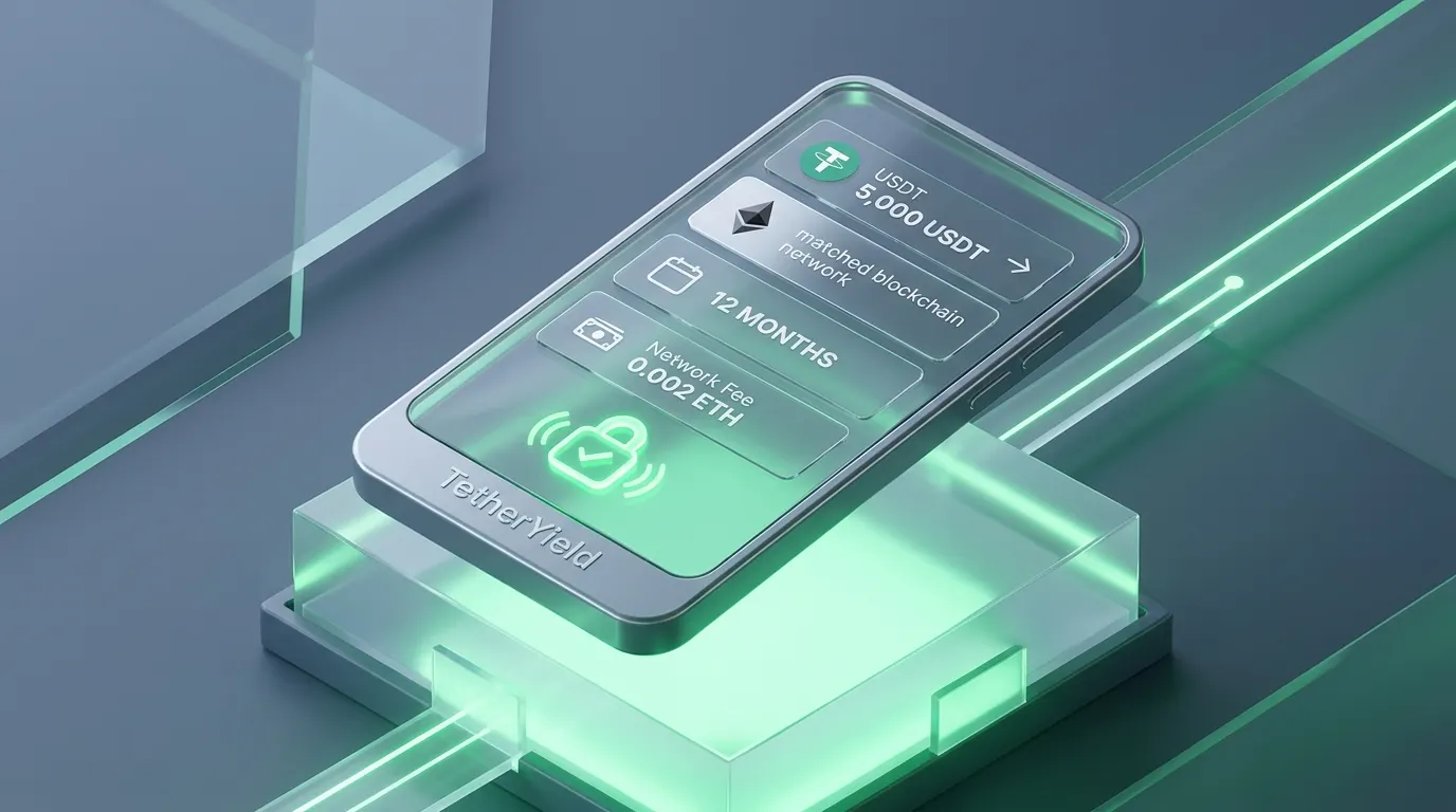
Before confirming any USDT allocation or withdrawal on TetherYield, take five seconds to review four critical parameters: the exact USDT allocation amount, the chosen blockchain network (TRC-20, ERC-20, or BEP-20), the lockup duration of your plan, and the deducted network fee.
- Allocation amount: Confirm the precise USDT amount you intend to deploy.
- Blockchain network: Ensure your personal wallet and recipient deposit lane share the exact same chain.
- Plan duration: Know whether your package is fully flexible or locked for a fixed investment cycle.
- Net return rate: Review the net expected return after accounting for standard platform and network fees.
- Wallet destination: Verify the leading and trailing characters of your destination wallet address.
Track yield progress in real time instead of guessing
The most common concern for mobile investors is not knowing whether a transaction went through, whether the capital has started accruing yield, and when the next payout will reflect in their wallet balance.
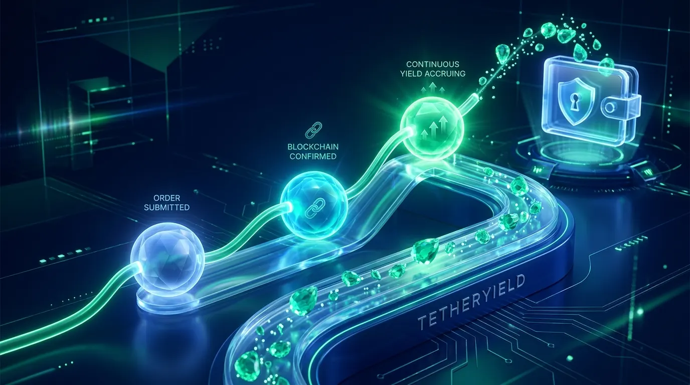
A trustworthy fintech interface replaces ambiguity with continuous visibility. On TetherYield, you can monitor every stage: submission received, network block confirmations in progress, plan activated, and each settled reward payout recorded directly onto your balance ledger.
- Explicit operational status: Know exactly where your allocation stands in the lifecycle.
- Live timestamp updates: Verified server timestamps provide peace of mind.
- Scheduled reward cycle: See the exact countdown to your next yield settlement.
- Unique transaction reference: Keep a dedicated identifier for effortless auditing.
- One-tap official support: Access dedicated help channels directly from your active session.
Mobile security: Convenience without compromising safety
Mobile interfaces excel at speed and usability, but high-impact financial actions should never happen accidentally. The ideal user experience removes unnecessary friction while retaining deliberate safeguards for every capital allocation.
Protective measures such as two-factor authentication (2FA), biometric face or fingerprint verification, and automatic warnings when an incompatible address format is detected ensure that your funds remain secure even when navigating on the go.
- Deliberate two-step confirmation: A distinct final checkpoint for capital transfers or commitments.
- Mismatched network warnings: Immediate alerts if an entered address does not match the chosen chain.
- Biometric authentication: Fingerprint or facial recognition protects unauthorized device access.
- Zero hidden fees: Transparent display of all network gas fees before any transfer is signed.
- No artificial rush: Interface design avoids aggressive countdown timers that provoke panic.
How to handle delays and temporary network congestion on mobile
During periods of heavy cryptocurrency market volatility, public blockchain networks can experience congestion, causing transactions to take longer than usual to confirm. Knowing how to interpret these delays ensures complete composure.
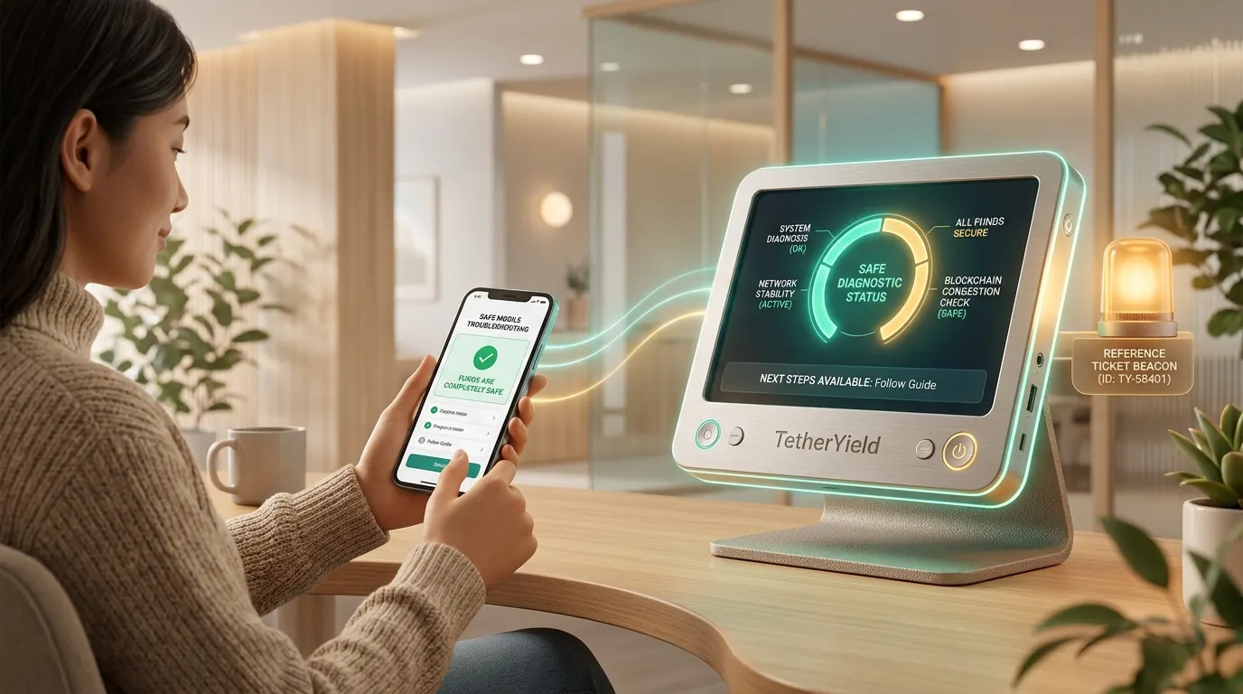
When an unexpected delay occurs, a robust mobile interface provides transparent diagnostic context: it clarifies whether your transaction is simply waiting for additional block confirmations, whether funds remain secure, and whether retrying is safe.
- Inspect the operational status tag: Check whether the transaction is waiting on blockchain block confirmations.
- Verify retry safety: Check whether the interface recommends waiting or allows an idempotent safe retry.
- Save your transaction reference code: Copy the unique session reference displayed on your screen.
- Audit on the public blockchain explorer: Click the TxID link to independently view on-chain confirmation progress.
- Contact official support with your reference: Provide the transaction code for immediate expedited investigation.
- Review operating terms and disclosures: Consult platform settlement windows for each supported network.