मोबाइल स्क्रीन पर ध्यान से जांची जाने वाली आवश्यक बातें
स्मार्टफ़ोन की छोटी स्क्रीन और वॉलेट, एक्सचेंज तथा प्रमाणीकरण ऐप्स के बीच तेज़ी से स्विच करते समय जल्दबाज़ी में गलतियां हो सकती हैं। ब्लॉकचेन लेनदेन में गलत नेटवर्क पर फंड भेजने से संपत्ति हमेशा के लिए खो सकती है।
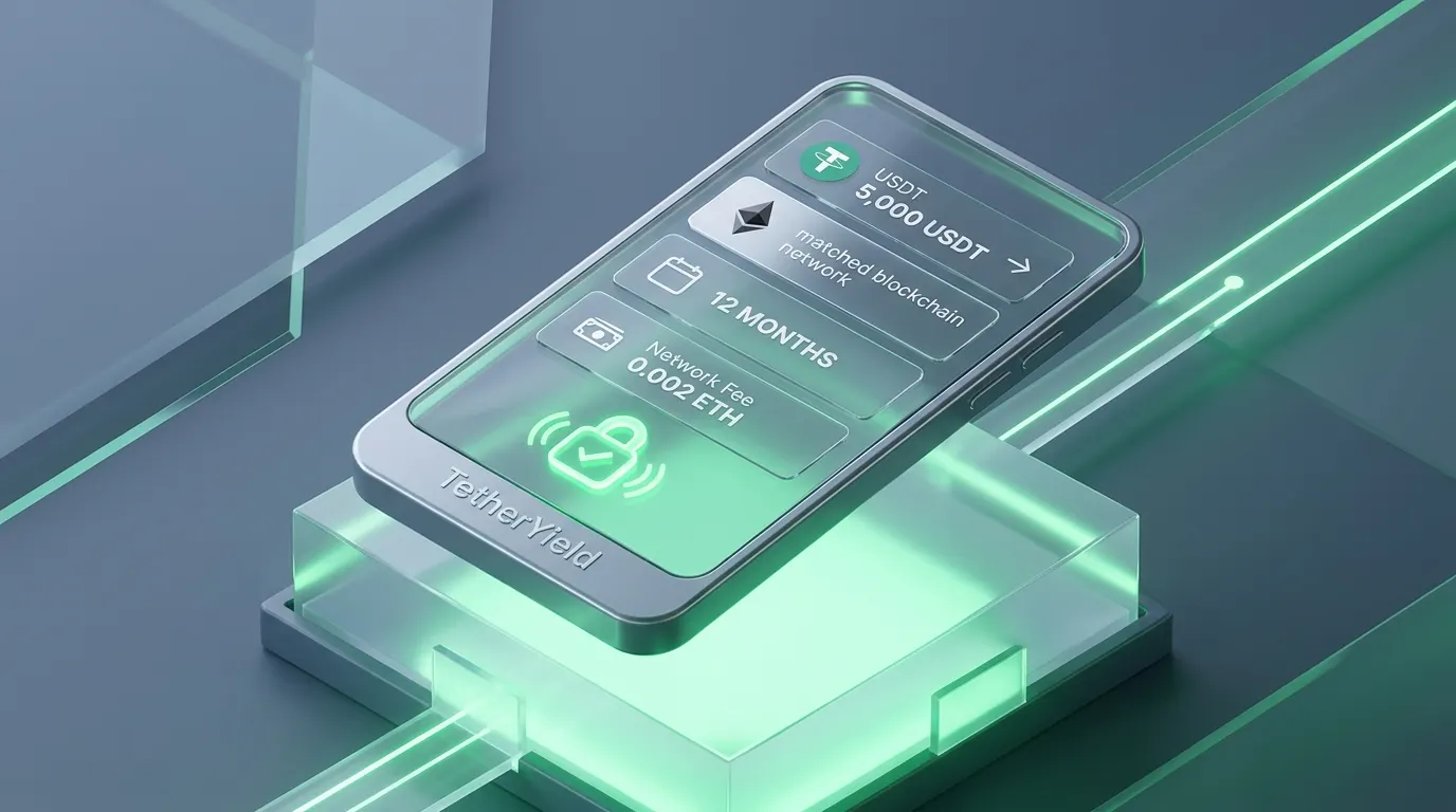
TetherYield पर किसी भी USDT जमा या निकासी की पुष्टि करने से पहले चार मुख्य पैरामीटर जांचने के लिए पाँच सेकंड का समय अवश्य निकालें: सटीक USDT राशि, चयनित ब्लॉकचेन नेटवर्क (TRC-20, ERC-20 या BEP-20), यील्ड प्लान की अवधि और काटा गया नेटवर्क शुल्क।
- USDT राशि: पुष्टि करें कि राशि आपके निवेश प्लान के बिल्कुल अनुरूप है।
- ब्लॉकचेन नेटवर्क: सुनिश्चित करें कि भेजने वाला और प्राप्त करने वाला वॉलेट एक ही नेटवर्क पर हों।
- प्लान अवधि: जानें कि आपका पैकेज कभी भी निकासी योग्य है या उसमें निश्चित लॉक-इन अवधि है।
- शुद्ध रिटर्न दर: नेटवर्क संचालन शुल्क काटने के बाद मिलने वाले वास्तविक अनुमानित रिटर्न को समझें।
- प्राप्तकर्ता वॉलेट पता: वॉलेट पते के पहले और अंतिम चार अक्षरों का हमेशा मिलान करें।
अनुमान लगाने के बजाय रियल-टाइम में यील्ड प्रगति ट्रैक करें
मोबाइल निवेशकों की सबसे बड़ी चिंता यह होती है कि ऑर्डर दर्ज हुआ या नहीं, फंड ने कमाई शुरू की या नहीं और अगली किस्त बैलेंस में कब जुड़ेगी।
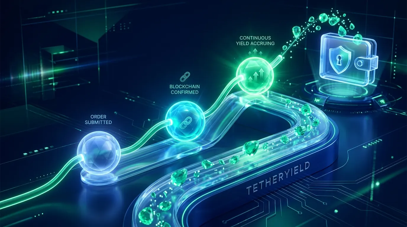
एक भरोसेमंद प्लेटफॉर्म आपके फ़ोन पर पूरी प्रक्रिया पारदर्शी रखता है। TetherYield पर आप हर चरण देख सकते हैं: ऑर्डर दर्ज होना, ब्लॉकचेन ब्लॉक पुष्टि, प्लान एक्टिव होना और बैलेंस में जुड़ने वाले लाभ का विवरण।
- स्पष्ट ऑपरेशनल स्टेटस: हर सेकंड जानें कि आपका लेनदेन किस स्थिति में है।
- सटीक टाइमस्टैम्प: सेकंड-दर-सेकंड सर्वर समय आपको पूरी निश्चिंतता प्रदान करता है।
- निर्धारित भुगतान शेड्यूल: अगले रिटर्न वितरण चक्र तक का सटीक समय देखें।
- अनूठा लेनदेन संदर्भ कोड: आसान ऑडिट और ट्रैकिंग के लिए समर्पित पहचान कोड।
- एक-टैप में सहायता: अपने सत्र से सीधे आधिकारिक सहायता चैनलों तक पहुंचें।
मोबाइल सुरक्षा: सुरक्षा से समझौता किए बिना अधिकतम सुविधा
मोबाइल इंटरफ़ेस बेजोड़ गति देता है, लेकिन महत्वपूर्ण वित्तीय कार्यों में हमेशा सोच-समझकर पुष्टि की जानी चाहिए। सिस्टम को इस तरह डिज़ाइन किया गया है कि आप तेज़ी से काम कर सकें और गलती से कोई बटन न दबे।
टू-फ़ैक्टर ऑथेंटिकेशन (2FA), फ़िंगरप्रिंट या फ़ेस बायोमेट्रिक लॉक और असंगत पते पर स्वचालित अलर्ट चलते-फिरते भी आपके फंड को सुरक्षित रखते हैं।
- सजग दो-चरणीय पुष्टि: पूंजी ट्रांसफर से पहले एक स्पष्ट अंतिम चेकपॉइंट।
- असंगत नेटवर्क अलर्ट: यदि पता चुने गए नेटवर्क से मेल नहीं खाता तो तुरंत रोकथाम।
- बायोमेट्रिक प्रमाणीकरण: फ़िंगरप्रिंट या चेहरे की पहचान से अनधिकृत पहुंच पर रोक।
- कोई छिपा हुआ शुल्क नहीं: लेनदेन पर हस्ताक्षर करने से पहले सभी गैस शुल्कों का पारदर्शी विवरण।
- कोई बनावटी दबाव नहीं: घबराहट पैदा करने वाले आक्रामक काउंटडाउन टाइमर से मुक्त साफ़ लेआउट।
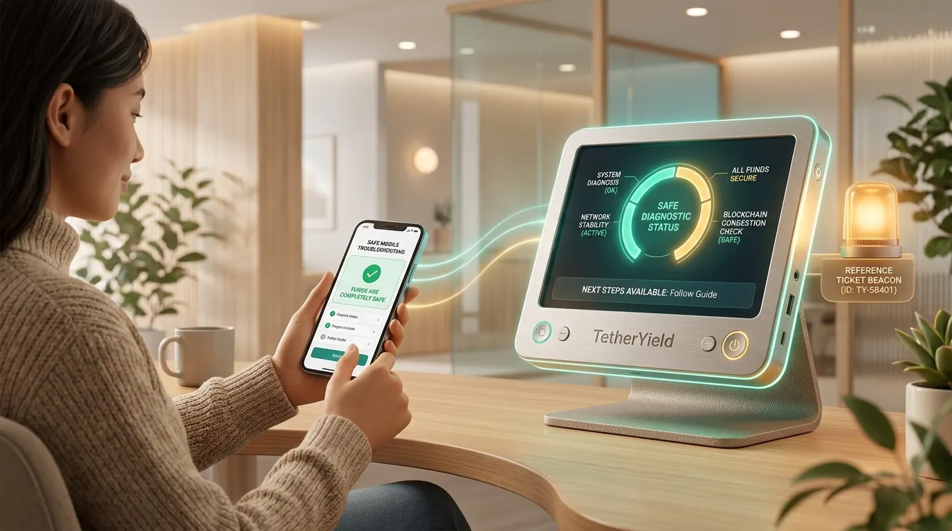
मोबाइल पर नेटवर्क देरी या अस्थायी व्यस्तता से कैसे निपटें
क्रिप्टो बाज़ार में भारी उतार-चढ़ाव के दौरान सार्वजनिक ब्लॉकचेन नेटवर्क व्यस्त हो सकते हैं, जिससे पुष्टियों में सामान्य से अधिक समय लग सकता है। इस प्रक्रिया को समझने से आप शांत रह सकते हैं।
जब कोई अप्रत्याशित देरी होती है, तो मोबाइल स्क्रीन स्पष्ट जानकारी देती है: लेनदेन अतिरिक्त ब्लॉक पुष्टियों की प्रतीक्षा में है, फंड सुरक्षित हैं और प्रतीक्षा करना सही है या सुरक्षित पुनः प्रयास।
- स्टेटस टैग की जांच करें: देखें कि क्या लेनदेन सामान्य ब्लॉकचेन पुष्टि की प्रतीक्षा कर रहा है।
- पुनः प्रयास की सुरक्षा जांचें: देखें कि क्या सिस्टम प्रतीक्षा की सलाह देता है या दोहरा शुल्क लगे बिना सुरक्षित पुनः प्रयास की अनुमति देता है।
- लेनदेन संदर्भ कोड सहेजें: स्क्रीन पर प्रदर्शित अनूठे पहचान कोड को कॉपी करें।
- ब्लॉकचेन एक्सप्लोरर पर देखें: ब्लॉकचेन पर स्वतंत्र रूप से प्रगति देखने के लिए TxID लिंक पर क्लिक करें।
- संदर्भ कोड के साथ सहायता से संपर्क करें: त्वरित जांच के लिए सहायता टीम को कोड प्रदान करें।
- नियम और जोखिम प्रकटीकरण पढ़ें: समर्थित नेटवर्क के नियमित निपटान समय की जानकारी रखें।